Why does your application need a redesign?
Functionality, performance, stability – you won’t argue that those are very important for application’s success, will you? However, the first thing that users notice when launching an app, is how it looks. In other words, its design.
A common case: if a user isn’t really interested in your application, its mediocre design can easily spoil his first impression and make him never launch it again. So let’s talk about the cases when your mobile or web app definitely needs a redesign.
Case №1: guidelines change
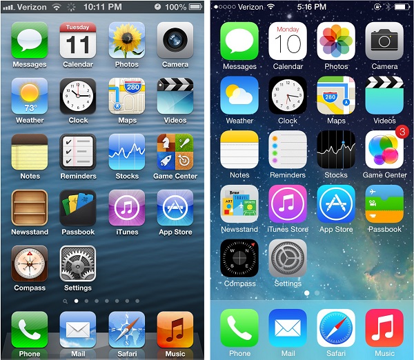
Sometimes it happens that OS developer changes its design guidelines. A headache for developers, but lots of eye-candy for users. For example, Apple’s transition from iOS 6 to iOS 7. The days of good old skeuomorphism are over.
No more interface elements with real-life objects imitation. Flat icons, half-transparent backgrounds – now everyone has to embrace this brand new design trend (from Jony Ive with love), whether you like it or not.
If your app still uses old design guidelines, you should update it, but we hope that you already did it – it’s been a long time since iOS6 release. An old interface looks really outdated compared to redesigned OS. Thus not the only interface but the entire app feels old-fashioned (welcome to 00s).
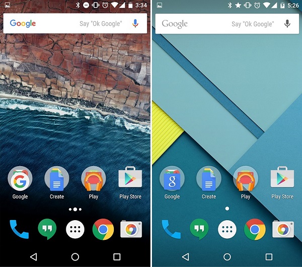
Google’s scenario is slightly different – Android OS had no design guidelines, so basically, they (also known as material design) were built from the scratch. Back in the day, every designer had to follow common mobile app UI/UX design principles (and his own taste and sense of beauty, of course).
Nowadays everyone has a well-detailed manual on how exactly each basic interface element should look like.
You can learn more about material design and other iOS/Android features in our blog post.
Case №2: outdated design
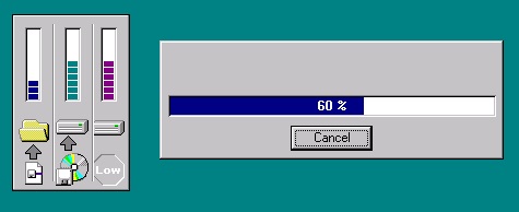
Have you ever installed a really old (we are talking about Windows 95-kind of old) application while using Windows 7/8/10?
Does this old Install Wizard seem to be outdated to you? Well, your app may look outdated as well, if it’s been a while since your last mobile application design update.
You don’t have to follow every new mobile app UI/UX design trend out there, but updating your application’s design from time to time is a serious tool to engage your audience to use your app.
Case №3: porting your app to another platform
Let’s say that you’ve developed an application for iOS (which follows Apple’s mobile application design guidelines). What’s next? Perhaps, you want to port your app to Android. The cheapest option you have when it comes to application interface design change is to keep everything the way it is.
Some customers prefer one platform’s design guidelines over others and they don’t bother redesigning their app for another platform. Sure, you can do it too if you’re tight on budget, but that’s hardly a good solution.
An app that was built for a specific platform while strictly following its design guidelines will definitely feel more natural and system-integrated than, per say, an iOS app ported to Android with no design change.
Case №4: application’s interface is too complicated
Your app has a rich functionality and works really well. Sweet! The only issue is that if someone wants to use it, he has to get a Ph.D. degree in astrophysics. Tons of different menus, sidebars, toggles, etc.
The era of Windows Mobile is over. The mobile interface design itself has to be as simple as possible. Nowadays an average user is really picky, especially when it comes to application interface design, thus even an app with an enormous amount of useful features is doomed if your users can’t figure out how to… Use it.
There are two obvious ways of solving this issue. First – to simplify your app’s interface. Make application interface design more user-friendly and easy to understand.
Easier said than done, right? Well, there is another way – to split your big and heavy application into multiple ones, so each of them can resolve different issues. Maybe it’s too extreme, but it works!
Case №5: company rebranding
So, you’ve changed your logo or corporate style? Altered your brand-book content? Fabulous! Now don’t forget to change your mobile application design as well.
The customer can easily be confused, if your application has an old logo in its icon or if it’s colored with your old corporate colors. “Did I download the wrong application? Is this app even being supported by its own developers?”
Don’t forget to redesign your application when the company is undergoing a rebranding if you want to avoid that kind of questions from your customers.
Case №6: great functionality, bad interface design
Nowadays you can name at least five different applications from five different developer teams that will resolve the same issue. Well, in most cases. The 1990s are long gone and so are 2000s.
Yes, back then you could continue using an application, even if it had a horrible design and the developers themselves didn’t know anything about those mystic “mobile app UI/UX design principles”.
There was no choice, so you were using what you could get. But not anymore. Imagine you have two applications with the equal feature set. One of them looks like an MS-DOS app, while the other has a beautiful, user-friendly interface that follows most of the modern UI-design trends. What will you choose? It ain’t even a question.
App redesign done right
It’s important to understand that you can’t change your app’s design just because you feel like it. If it won’t improve the user experience for your customers – you shouldn’t do it. It sounds weird, but redesigning your app is not a designer’s job.
Well, actually it’s not only his job. Full mobile (or any other) application redesign involves a wide variety of specialists (designers, business analysts, marketers, etc) and consists of several major stages:
- Team has to define its objectives, target audience, project’s features. This stage defines application’s logic. If you want to alter something – it’s the best time to do it. It’s easier to change a plan than an actual application.
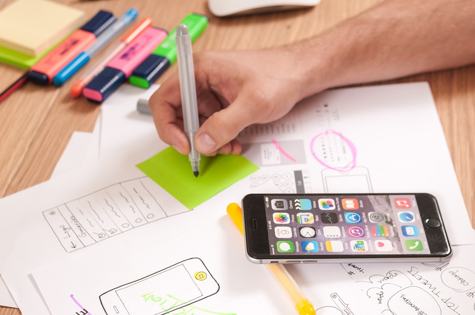
- Wireframe. Basically, it’s application’s blueprint (yet quite simplified). It contains the application’s most vital elements and describes the way they are going to interact with each other.
- Application’s color palette, style, logo/icon development.
- Dynamic prototype. Although this prototype cannot be considered as the working application itself, it can give you an understanding of application’s final look, interface elements’ interaction, etc.
- Tests. Lots of them. These tests should point out most of mobile interface design issues. When all issues are resolved, the development team can finally start an application development.
All those stages imply serious redesign which isn’t a must in most cases. When there is a need for such a radical design change? Well, there are many different reasons – change of application’s logic, new features, high bounce rate, etc.
But what if that’s not the case? Sometimes you just need to freshen your app, make it a little bit more user-friendly. That makes things easier a lot and cuts the work scope. A light redesign can be done with slight changes in color palette, overall interface style, and layout.
If you still can’t decide which kind of redesign suits you best, contact us! We’ll help you out with any kind of application redesign.
